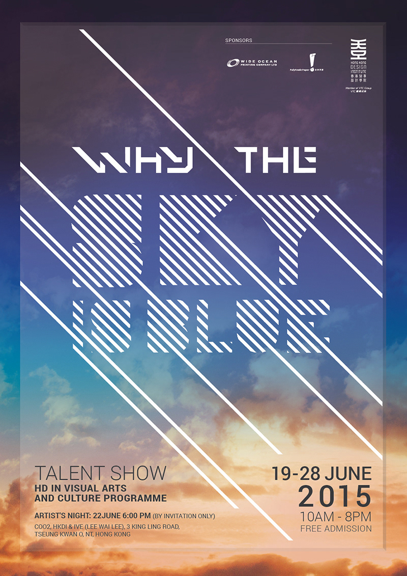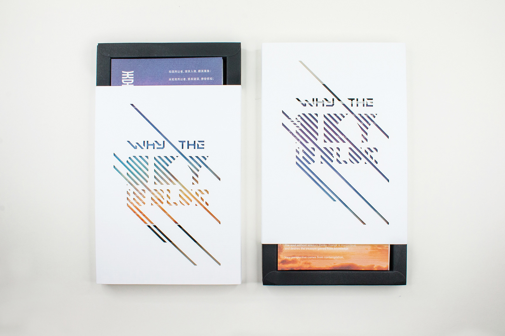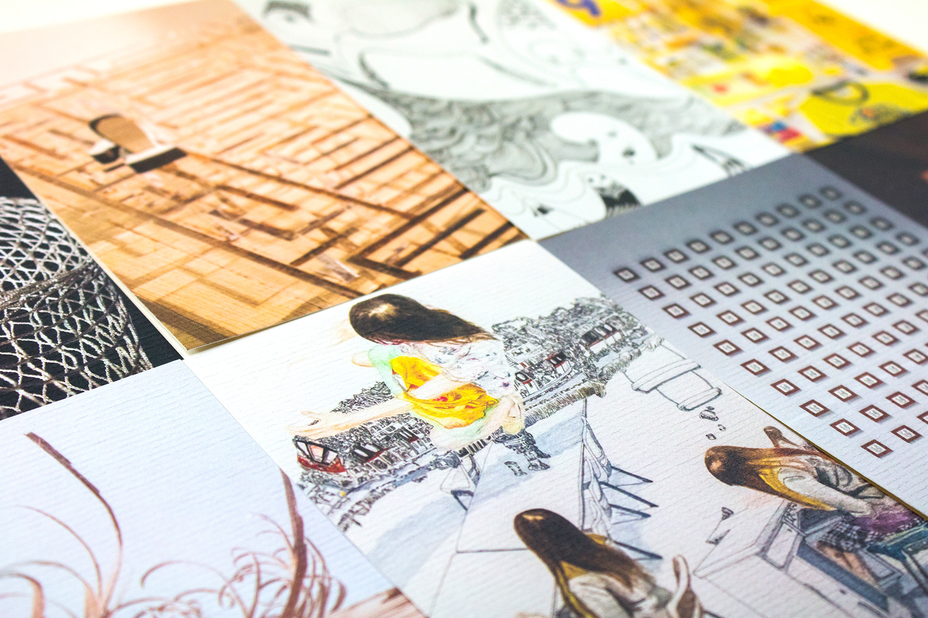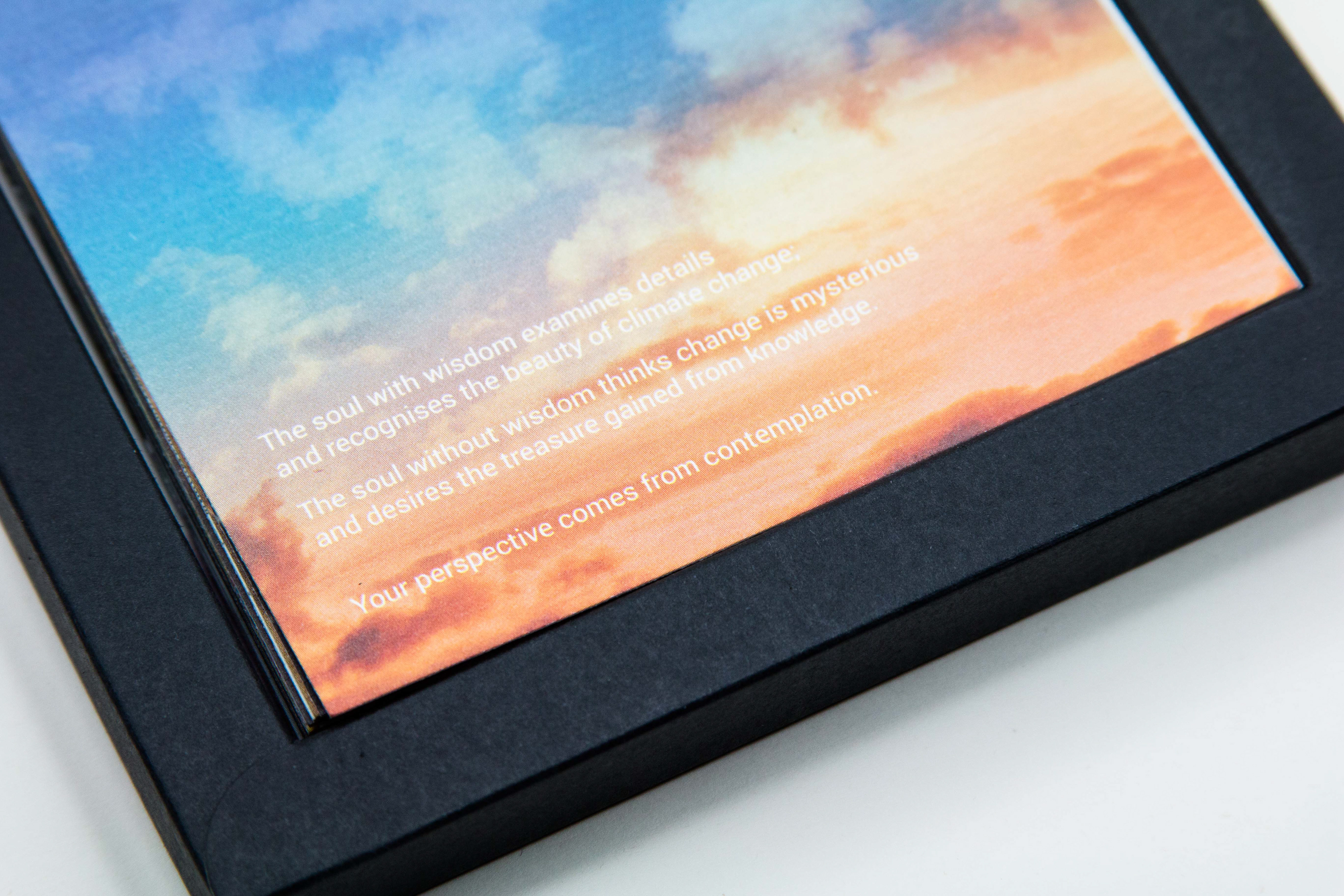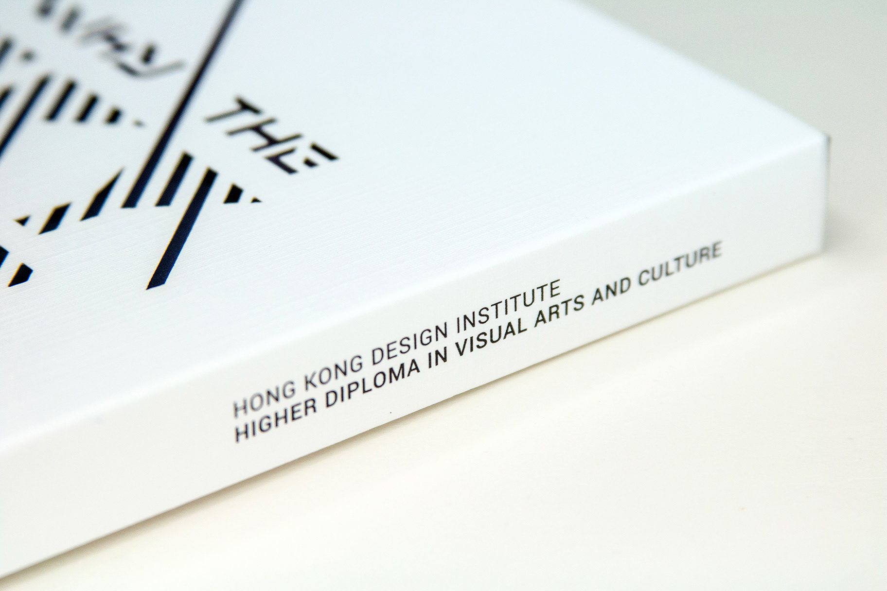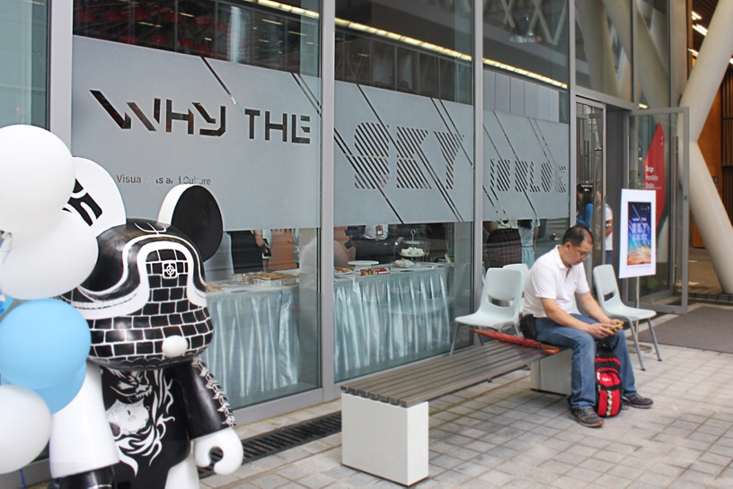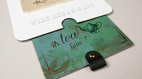
Marketing Material Design for Hong Kong Design Institute - Visual Art and Culture Program Art Show 2015. The Concept " Why the Sky is Blue" came from a student who's question how many people notice blue is not the only color of the sky and why the color of the sky changes. Therefore, the key visual of typography design is made by strokes from left to right, inspired from the scientific explanation which is the color of of the sky changes because of the light angle. Moreover, the promotional postcard packaging demonstrates the main concept of the theme. When the audience slide up the sleeve/box, the color inside the diecut changes as the Sun raises; when the audience slide down the sleeve/box, the color inside the diecut changes as the sunset. This packaging not only bring out the concept by visual but also interactive experience.